


A Pre-Raphaelite Christmas Card
Merry Christmas from The Culture Dump

It didn’t feel right to publish an exhibition review or reading list this morning. Today is Christmas Eve. Museums and bookshops are closed for the holidays, and it’s time for reflection, revelry, and rest.
So, this article is a Christmas card. It’s a heartfelt thank you for following The Culture Dump. Just by reading this, you’re breathing life back into the world of museums, arts, and humanities — and believe me, they need it.
I’m currently working on a project for 2025 which involves a lot of thinking about close reading; or, as I like to call it, slow looking. This is the art of digesting pictures like a book. It involves thinking about colours, lines, textures, and paint strokes as if they’re words and sentences. So, my Christmas present to you is little exercise in looking — hopefully one you can fit in between gift-wrapping, drinking, and rearranging the Christmas tree — to get you in a thoughtful, reflective, holiday spirit.
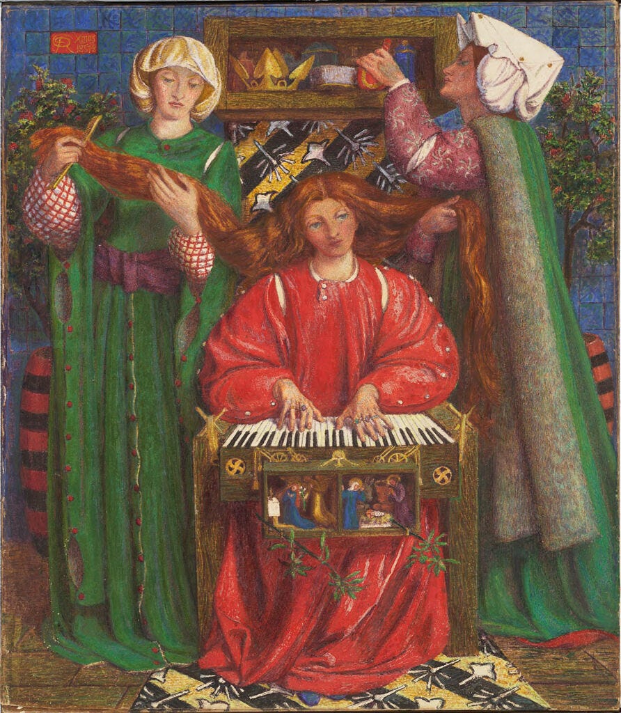
With all this in mind, let’s have a slow look at Dante Gabriel Rossetti’s Christmas Carol.
Rossetti is a Pre-Raphaelite painter. I’ve been thinking a lot about the Pre-Raphaelites recently, because I’ve been working at an art gallery that specialises in them. The Pre-Raphaelites were a group of Victorian artists who challenged academic standards. They disagreed with the limited, elitist ideas about style, subject, and genre which were held by art institutions in the eighteenth and nineteenth centuries.
Rossetti and his cohort believed that the kind of art which was produced before the Renaissance (so, before 1500-1600, ish) was more honest, pure, and intuitive. They wanted to evoke Medieval colours, mystical symbols, and folk narratives. They were essentially thinking ‘Pre-Raphael’. Hence Pre-Raphael-ite.
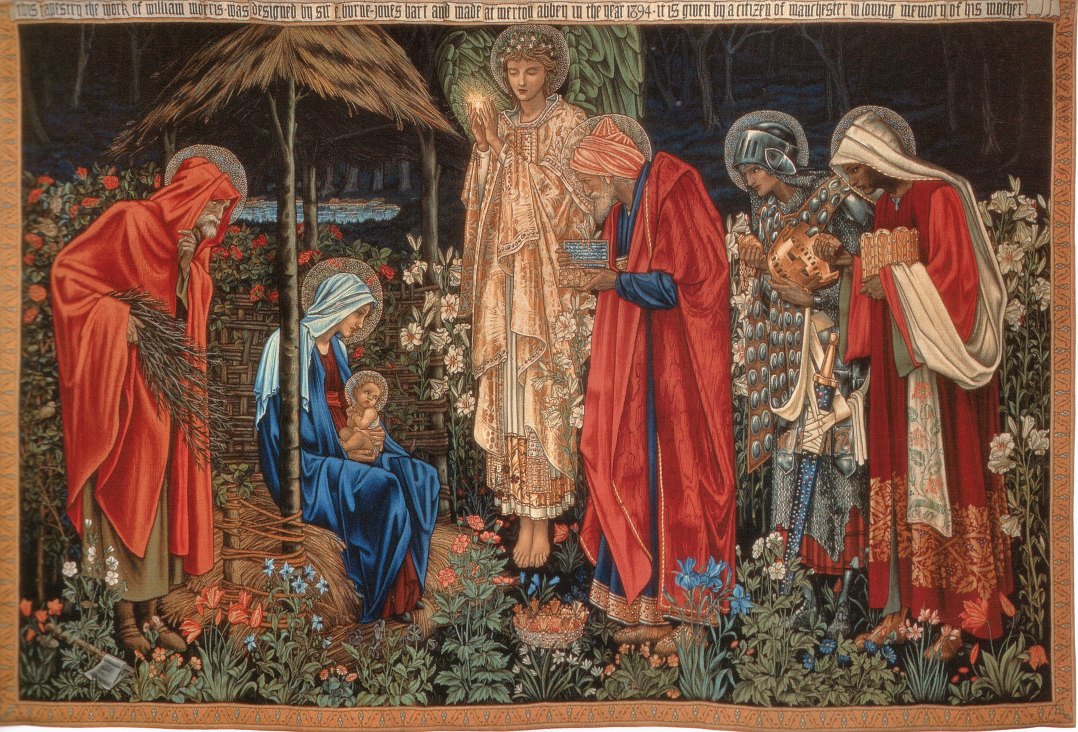
And it is this fantastical, idealised, Mediaeval quality of the Pre-Raphaelites which make their paintings really excellent Christmas cards. They really loved a Nativity or Adoration of the Magi scene.
But what’s interesting about Rossetti’s Christmas Carol is that it’s not a Nativity scene — not exactly. There’s no baby Jesus or adoring Kings. This is, I think, what makes it such a good expression of Christmas: because it’s more focused on the traditions of the Christmas celebration (that is, carolling), than on the Christmas story.
Look at Rossetti’s rich, primary colours. The fabrics and gems in his painting are shiny and glittering. This sumptuous quality tells us, immediately, that it’s a festive scene. Look closely, and you’ll see holly growing out of the wall and the clavichord. Look closer still, and you’ll see a hidden Nativity scene. Yet, despite the festive colours, there’s something about this painting that’s not completely celebratory. The expressions on the ladies’ faces aren’t obviously joyous: rather, they’re deeply pensive, and even a bit austere.


In order to unravel the meaning of this painting, the first place we need to look is at composition. Composition is how the image is structured — where the lines go, whether they’re curvy or straight, how the figures are arranged, and what your eye is drawn to first. My first impression of this composition is that it’s very rectilinear. The figures are straight-on. There are no obvious, big, swooping curves or diagonals. The painting structured like a grid, or a game of Tetris. This gives a sense of stability, harmony, and stasis.
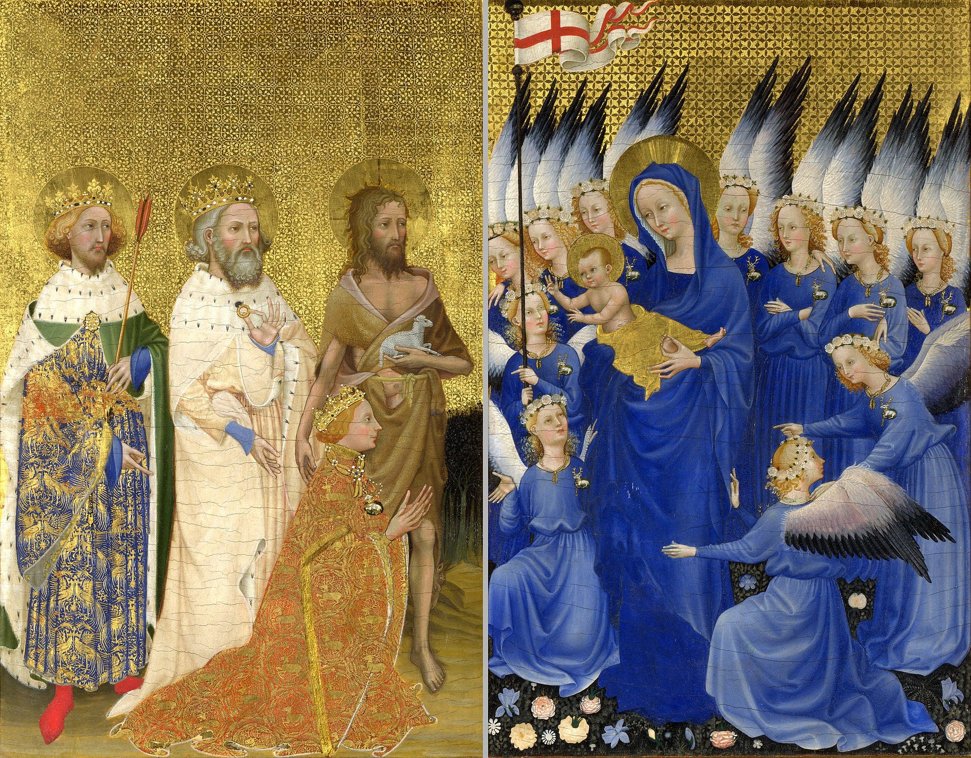
Note, also, how Rossetti’s picture is remarkably flat. There’s no horizon in the background. There aren’t really any shadows or three-dimensional shapes. Compare it, for instance, with Jan Gossaert’s Adoration of the Kings (1510) — another nativity-type scene — and you’ll see what I mean. Gossaert’s has depth and height and dimension. Rossetti’s is entirely two-dimensional. This is not a bad thing, by the way. It simply imparts a sense of simplicity and harmony. It’s stylised. It’s quaint.


Next, I like to look at colour and light. As we know, Rossetti’s painting is eye-wateringly saturated, particularly the greens, blues, and reds. The women’s Medieval-style gowns are intoxicatingly bright (we know they’re Medieval because of their gussets and wimples). There are some really shiny hints of gold too — like the big, yellow crown in the top left and the bumblebee carpet. But also, although Rossetti’s painting is very colourful, it’s got no contrast. There are no deep dark shadows, of the kind we might associate with Baroque painting like those seen in Baroque painting by Caravaggio and his followers. Because of Rossetti’s bright colours and flat perspective, the overall atmosphere of his work is one of fantasy, not realism. You would have no idea that Rossetti was painting almost three hundred years after Gossaert and Caravaggio — and that’s the whole idea.
Now, let’s consider the material qualities of the painting: size, medium, framing, signatures (etc.). Rossetti’s Christmas Carol is rather small — 34.3 x 29.7 cm (13 1/2 x 11 11/16 in) — and it’s painted in water-based paints: gouache and watercolour. Both of these features are reminiscent of devotional images from earlier periods: that is, small, portable paintings which could be displayed at home, with the goal of prompting religious contemplation. Perhaps Rossetti may have been deliberately evoking this Mediaeval tradition in order to ascribe a sense of personal, intimate, spirituality?
Only after these initial observations of composition, colour and light, and material qualities would I do some cursory background research — either online, in a museum catalogue or journal database (like JSTOR), or a library. I’d look up, for instance, whether the main character was modelled after someone in Rossetti’s life. In this case I’d find (rather quickly) that she certainly was. The red-headed woman in Rossetti’s Christmas is based on Lizzie Siddal, the woman who would later become Rossetti’s wife and who is the hallmark of Pre-Raphaelite beauty. Think, John Everett Millais’ Ophelia.


I’d also discover that Rossetti’s Christmas Carol is in fact an illustration of a poem of the same name by his friend, the writer Algernon Charles Swinburne. It goes like this:
Three damsels in the queen’s chamber,
The queen’s mouth was most fair;
She spake a word of God’s mother
As the combs went in her hair.
Mary that is of might,
Bring us to thy Son’s sight.
They held the gold combs out from her,
A span’s length off her head;
She sang this song of God’s mother
And of her bearing-bed.
Once we have this context, all the pieces start to knit together. We know who the characters are, what they’re doing, and what it all means.
Rossetti’s Christmas Carol is an illustration of a Queen and her two maids (damsels). These maids are engaging in the intimate ritual of brushing the monarch’s hair, while she sings a song about the Nativity. This explains why the painting is so colourful, and yet so staid. It’s an image of quiet, personal celebration. It reflects the inherently sacred and elevated nature of festive traditions: singing, decorating, and celebrating together.
So, maybe that’s something to keep that in mind when you’re humming along to Christmas songs, maybe over a glass of eggnog, tonight and tomorrow? In keeping these traditions alive, you’re actually engaging in a centuries-long, ritualistic practice.
What’s more Pre-Raphaelite than that?
Merry Christmas, and a Happy New Year.
Thanks for reading! Check out my Instagram at @culture_dumper, where I post daily updates on my academic work, life, and current exhibitions in London.
Another excellent article, thank you so much, Rebecca!💕 A good reminder to look past the surface. A very Merry Christmas to you!🎄
Thank you so much for taking us through an art historian’s thought process. It is an eye-opener for this engineer!
Merry Christmas!